


Best Interior Paint Colors for Restaurants and Cafés
Walk into a restaurant, and before you even look at the menu, the space already tells you something. The colors on the walls quietly shape how customers feel; relaxed, energized, curious, or even hungry. In the hospitality world, the right paint color isn’t just decoration; it’s part of the dining experience.
If you’re planning a new restaurant or refreshing your current space, choosing the right shades can transform the atmosphere. In this guide, you’ll learn how color psychology influences diners, which shades work best for cafés and restaurants, and how thoughtful design choices can help create a memorable environment.
Warm Colors That Stimulate Appetite
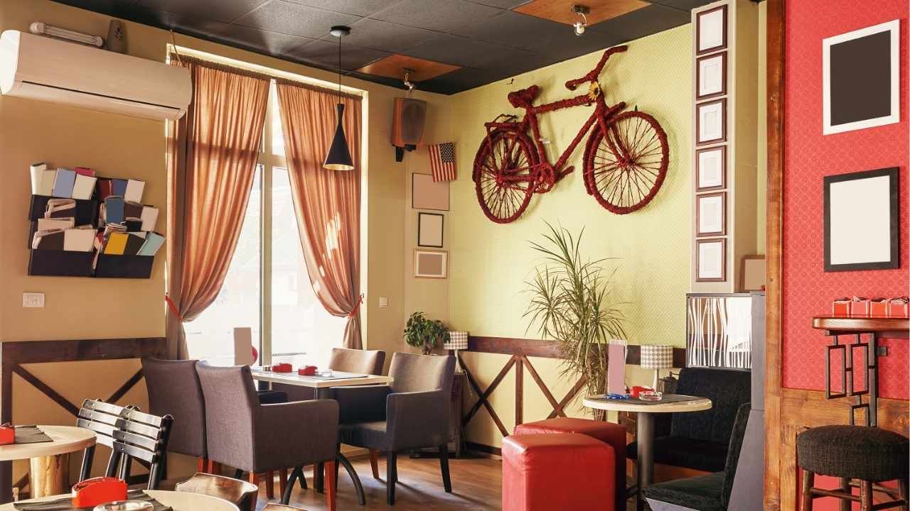
Warm tones are some of the most popular choices for restaurants because they naturally encourage appetite and conversation. Shades like terracotta, burnt orange, and deep red create an inviting environment where people feel comfortable lingering over a meal.
These colors are often used in dining rooms because they evoke warmth and energy without overwhelming the space.
Popular warm tones include:
Terracotta for a cozy, rustic feel
Muted red for classic dining spaces
Soft coral for trendy cafés or brunch spots
Golden yellow accents to brighten the room
Restaurants that focus on comfort food, family-style meals, or Italian and Mediterranean cuisine often benefit from these rich, warm palettes.
Of course, applying these tones effectively requires professional planning. Many restaurant owners consult experienced commercial painting contractors in Bellingham WA to ensure the colors work well with lighting, furniture, and overall design.
Neutral Colors for Modern and Upscale Spaces
Neutral colors have become increasingly popular in modern restaurants and upscale cafés. Shades like soft gray, warm beige, cream, and taupe provide a clean, polished backdrop that allows décor and plating to stand out.
These colors are particularly effective for minimalist interiors or fine dining establishments where the focus is on the food presentation and atmosphere.
Benefits of neutral tones include:
They create a calm and sophisticated environment
They pair easily with different décor styles
They make spaces feel larger and more open
They allow accent pieces like artwork or plants to shine
When combined with thoughtful interior painting, neutral palettes can give restaurants a timeless look that stays appealing even as design trends evolve.
Earthy Greens and Natural Tones for Relaxing Cafés
Many cafés and casual dining spaces are turning toward earthy colors inspired by nature. Shades like sage green, olive, clay, and soft browns help create a relaxing environment where customers feel comfortable staying longer.
These colors work especially well for coffee shops, organic cafés, and farm-to-table restaurants.
Natural color schemes often include:
Sage green walls paired with wood accents
Olive tones that complement plants and natural light
Muted browns or sand colors for a grounded look
Dusty blue accents for balance and contrast
This palette works beautifully when combined with natural materials like wood furniture, stone countertops, and greenery throughout the space.
Restaurants that embrace natural aesthetics often collaborate with experienced commercial painting specialists to achieve smooth finishes and consistent color application across large interior surfaces.
Accent Walls That Create Visual Interest
Accent walls are an easy way to add personality without overwhelming the room. A bold color on a single wall can draw attention to a bar area, feature seating section, or branded mural.
Some effective accent ideas include:
Deep navy or charcoal behind the bar
Rich forest green behind booth seating
Muted mustard yellow in a café corner
Textured or limewash finishes for artistic appeal
Accent walls also help guide the visual flow of the restaurant, subtly directing customers toward key areas like ordering counters or specialty displays.
When used strategically, these design details can make a restaurant feel unique and memorable without requiring a full redesign.
Case Study: How Color Improved a Café’s Customer Experience
A neighborhood café decided to update its interior after noticing that customers rarely stayed longer than 15 minutes. The space originally had plain white walls and harsh lighting, creating a sterile atmosphere.
The owners chose a new palette featuring soft sage green walls, warm wood accents, and a muted terracotta accent wall behind the coffee bar. Within weeks of reopening, the atmosphere felt warmer and more inviting.
Customers began staying longer to work, socialize, and enjoy multiple drinks or desserts. Average visit time increased significantly, and the café saw a noticeable boost in daily revenue.
Create an Atmosphere Guests Want to Return To
Color plays a powerful role in shaping how customers experience your restaurant. From warm tones that encourage appetite to calming neutrals and nature-inspired shades, the right paint choices can transform the mood of your entire space.
If you’re planning a redesign or opening a new location, take time to choose colors that reflect your brand and enhance the dining experience. Get in touch with professionals who understand both design and durability, then watch your restaurant atmosphere come to life.